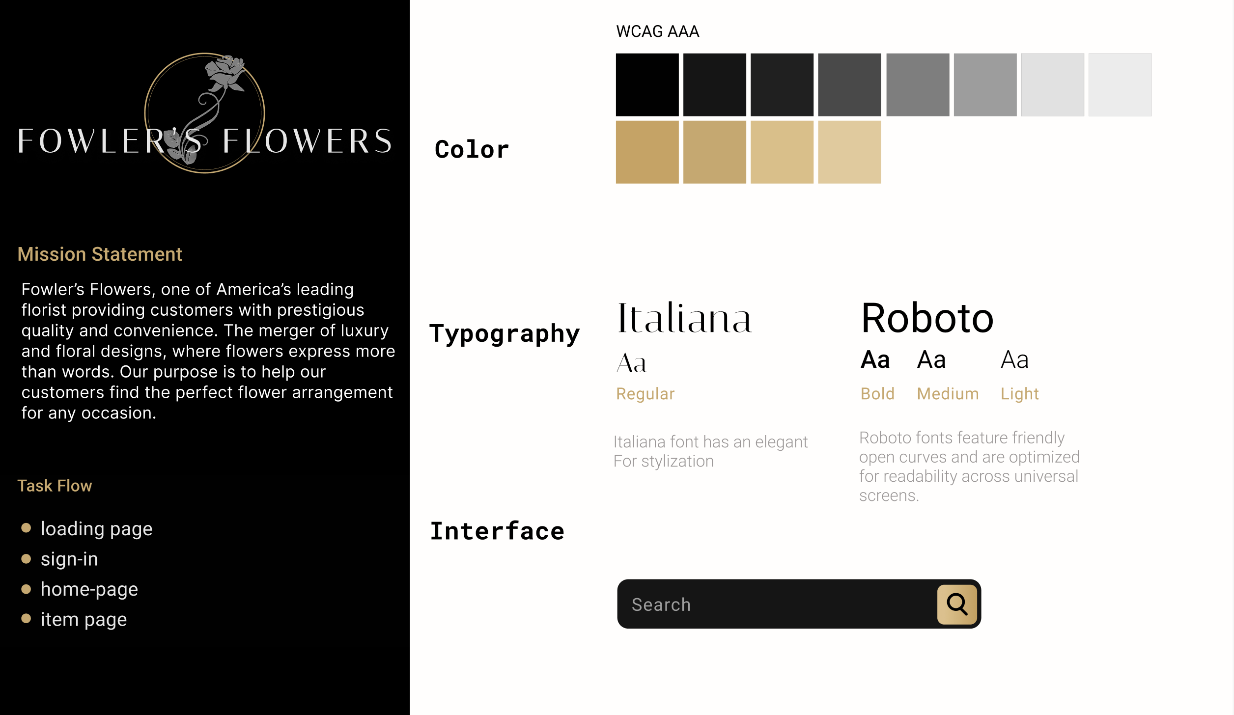
Fowler's Flower's Mobile Application
The inspiration for this project originated from my own experience having difficulty navigating local florist sites. I discovered it to be very common for floral companies to be clunky, bright, or visually outdated. I created the challenge of a luxury high-end florist shop targeting the less common male users. The goal of this project was to create a “mood” reflecting the companies brand and consolidate common webpage data into a smooth and elegant mobile application.
-
CLIENT
FOWLER'S FLOWERS -
MY ROLE
UX RESEARCH
UI APP DESIGN -
PROJECT DATE
FALL 2022 -
TOOLS USED
FIGMA
ADOBE PHOTOSHOP
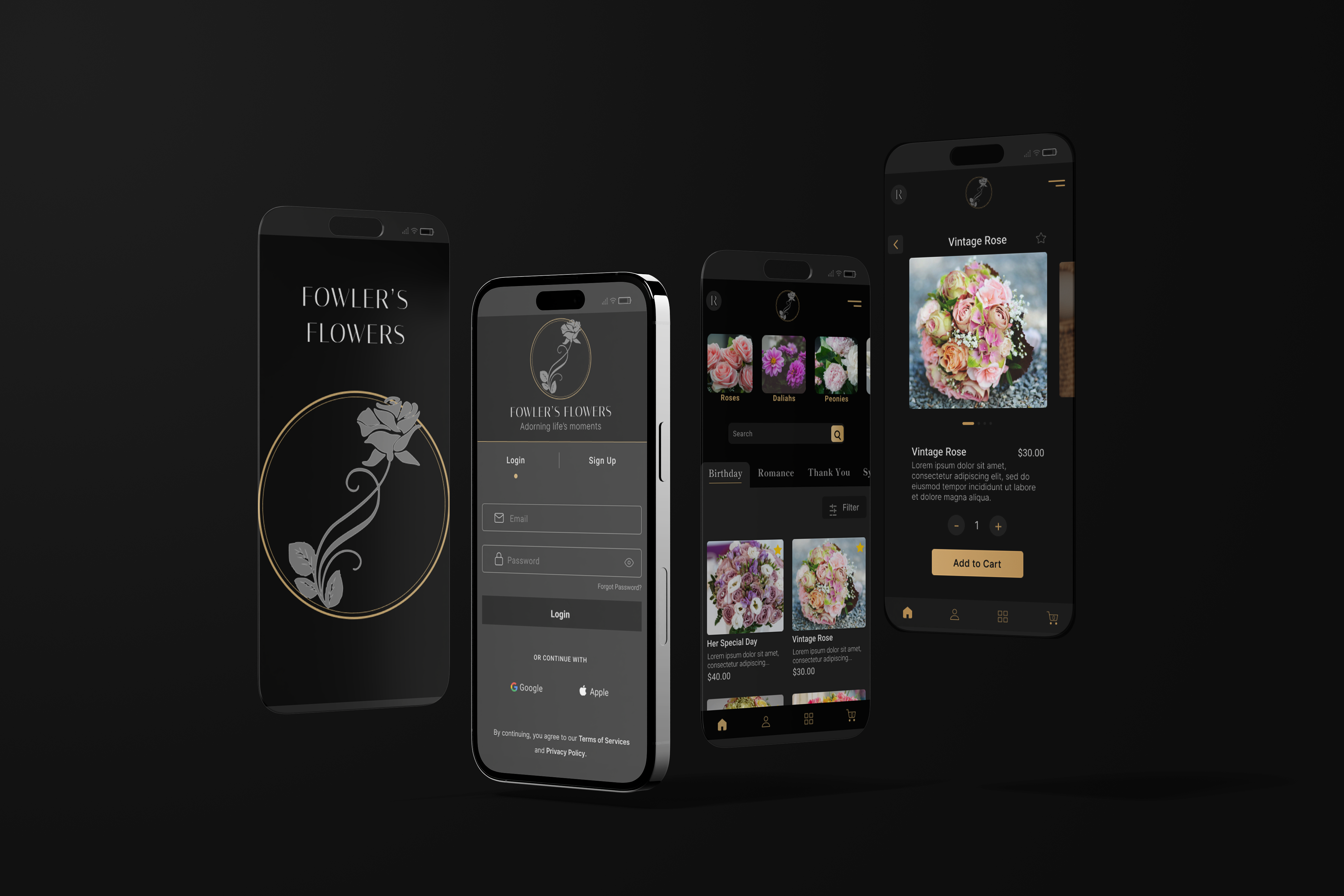
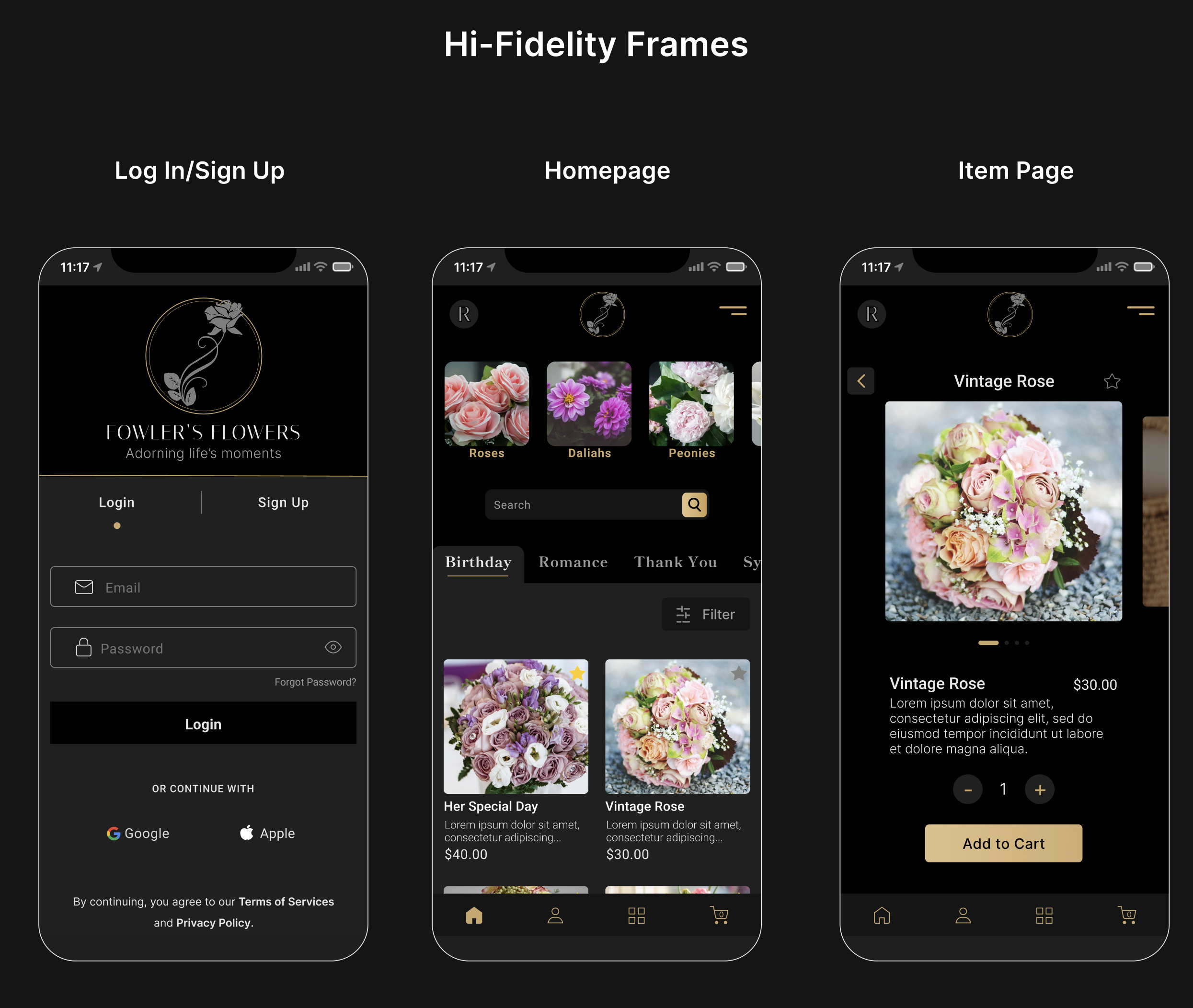
DESIGN FEATURE
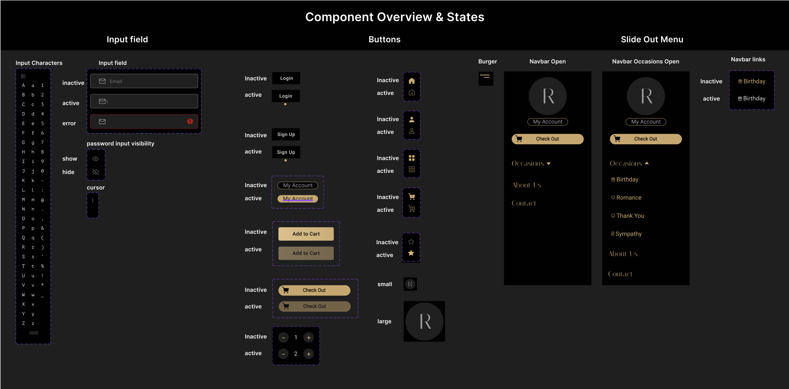
One of the key features of this application is the use of the large browsing tab. Here the match between system and the real world heurstic comes in to play. Upon logging into the application the user easily distinguishs between pages and categories while browsing with a familiar layout of real life folders and the intuitive swiping motions of a modern touch screen.
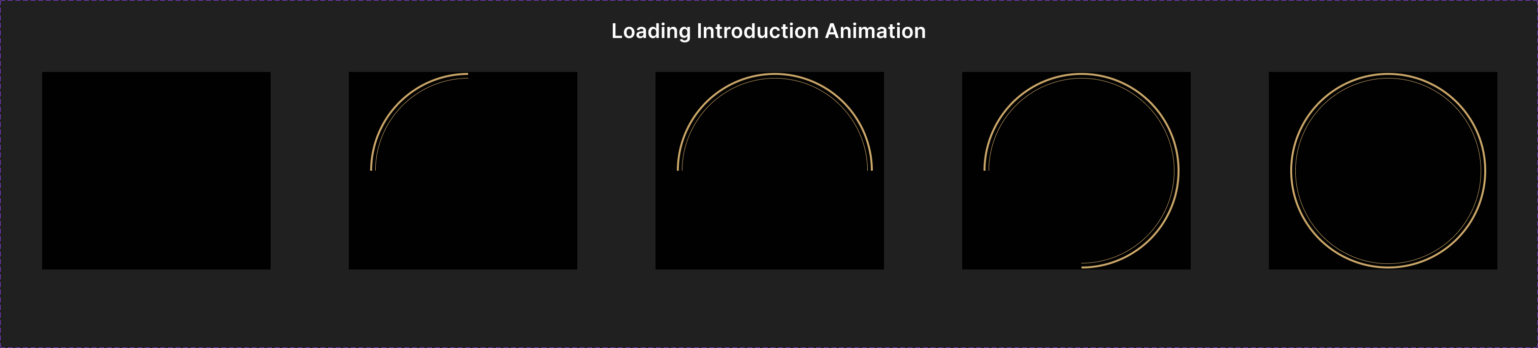
MICRO ANIMATIONS
This design and prototyping was entirely created in Figma. The transition states between log-in and sign-up is light weight and powerful in visuals. It sets a clean elegant tone to the application. Although figma has some limiations of prototyping, here you can see multiple states of the loading wheel, completing a smooth animation.
Loading Component Animation Segments
RESEARCH METHODS
To create this concept project, I first brainstormed a mock company, their goals, branding, and a client request. Before approaching the initial design I evaluated the common issues faced while interacting within competitor sites. There I established a baseline utilizing a customer journey map and several heuristics evaluations. Based upon the company’s branding, a persona was created reflecting the ideal target audience. I then gathered design element examples for a moodboard, listed ideas and concepts and began the process of building a wireframe to hi-fidelity prototype. After conducting a prototype test for aesthetic-usability, tap ability, navigation, I collected users feedback and re-evaluated design decisions.
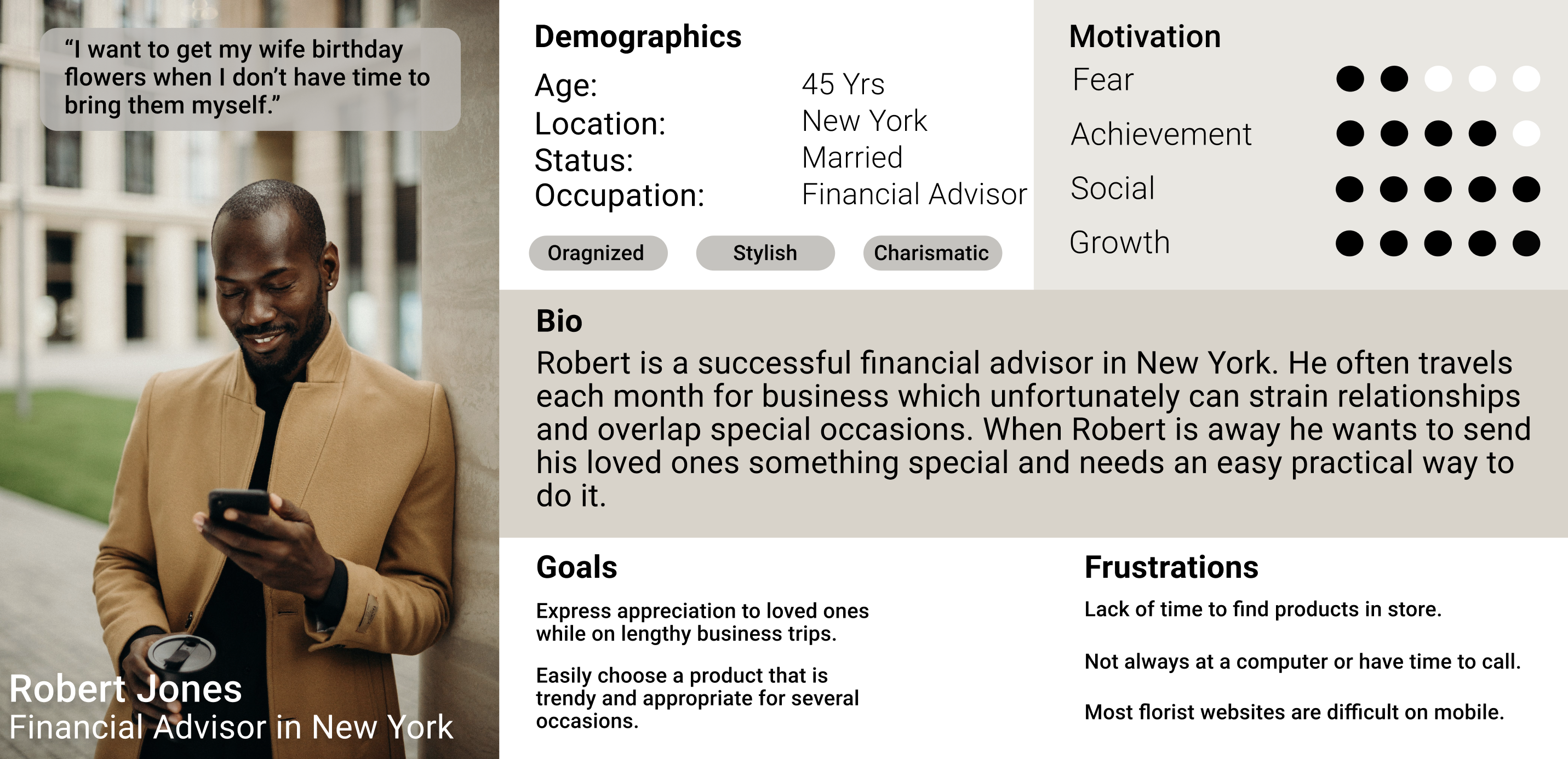
Breakdown Summary
Persona
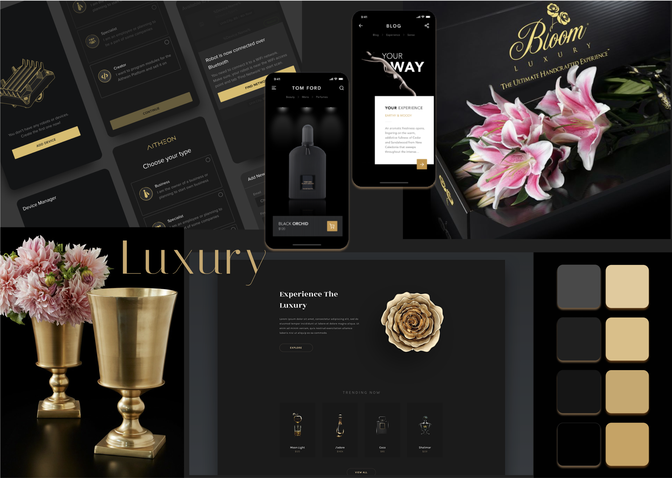
Moodboard
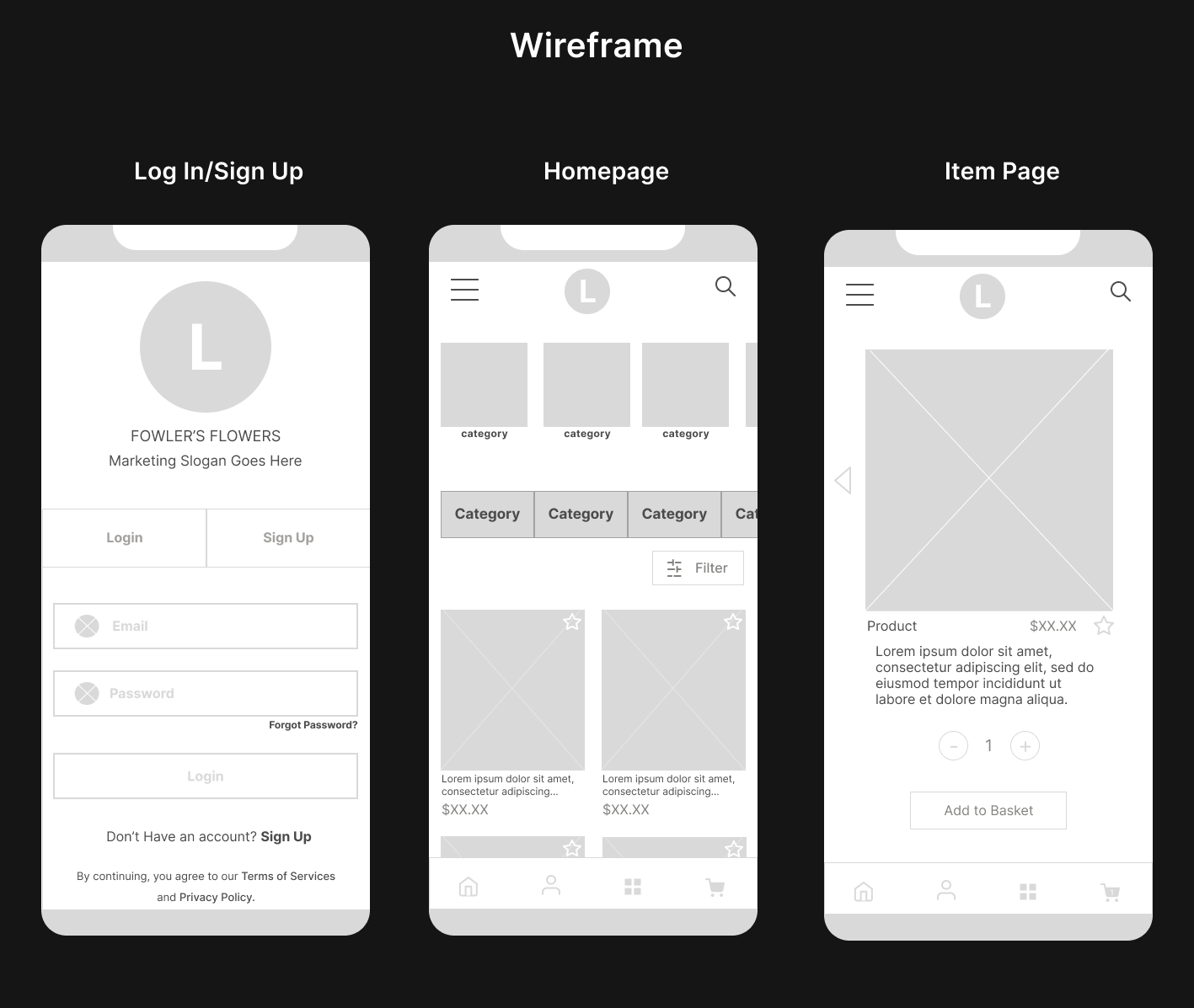
Wireframe
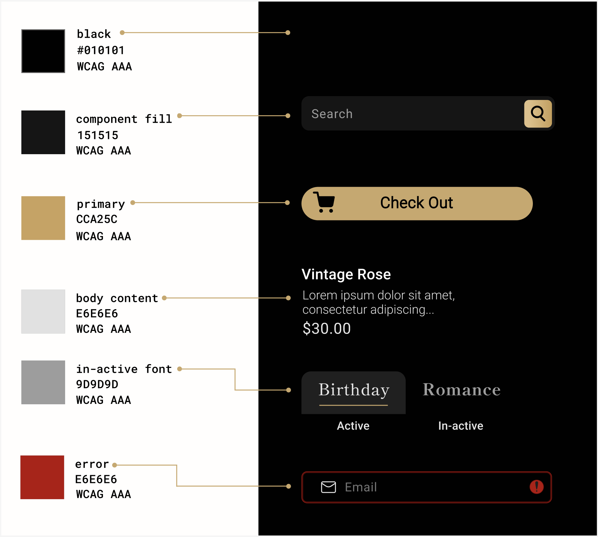
Colors Palette
Component-Overview
CLOSING
The success of this thought-provoking conceptual endeavor demonstrates that you cannot make good design without UX. I enjoyed engaging with the design elements, leading to a development process that embraced a comprehensive design system rather than just focusing on individual components. This holistic approach allowed for a deeper understanding of the overall vision.


Let's Work Together
Whether you have a project in mind or would simply like to chat. Feel free to message me. Let's ideate.